On Wedding Colors...Again?!?
Ok, before you hit me with a broom...You have to hear my side. I have been in so much confusion, yes even after my previous post AND have had sleepless nights (ok, i may be exaggerating on this one) BUT, i have changed my wedding color once again.
Yes, from Shades of Purple, to Red, to Orange & Pink, to Tiffany Blue, to Monochromatic Aqua/Turquoise...now it's Fuschia & Orange with a hint of Caramel.
I've always thought that Pink & Orange would look gorgeous in summer. These citrus shades would make our summer wedding more vibrant & festive. So when I showed this the first time to Randy, my mom, and some of my female entourage, they didn't like it. So turquoise it was.
But for some reason, I felt that something's wrong and that although Turquoise is a lovely color, I am somehow not yet sold. So after searching the net, I found Leslie's (a fellow w@wie ) pictures with her bridesmaids.

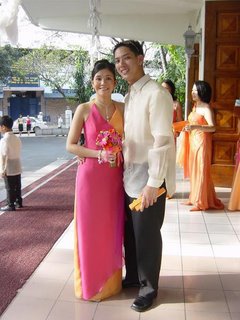
I also saw this picture of my friends, Dojie & Elaine Hipolito and I am really amazed on how these colors register well in pictures!
Here's another one I found while surfing the net. It's a Jim Hjelm bridesmaid's dress.

Armed with lovely pictures, I showed Randy and then e-mailed them to my mom. And guess what? They liked it! I e-mailed Veluz, my designer and told her I have changed my wedding colors. She then made me feel happier (& prouder) when she said that Blue, actually, doesn't go well with barong. Blue is a cool shade while a barong being a beige-y/off white-ish shade is a warm tone. Having Orange & Fuschia is a good choice since both are very warm colors. To lessen the brightness/intensity of these two colors, Veluz said adding a hint of Caramel as an accent color is essential. She said it would be nice...promise daw!
if you notice, I started using orange font too. I can't find the right shade of pink-- that's why!
So they you go...til the next color choice. hehehe. I hope not!


hi edrei!
that's what Veluz also advised me. we also wanted a turquoise motif but she said it doesn't go well with piña. and so, we have wine red, shades of orange (rust, melon and pomelo) and gold. dami noh? hehe... :)
happy preps!
hi edrei. thanks for dropping by my site. and thanks for the link. i still don't remember who made that dress. btw, i love your colors.
shelly: i'll try to look for it... i know i saved the picture of that a similar junior bridesmaid dress. i'll let you know. btw, i'll link u up ha?
leah: nice colors! oo nga, ang dami..but i'm sure it will be nice because those are rich colors!
hi edrei,
thanks again for the link. yes, link me up. i'll link you , too. ok??